JessReacts764
patreon
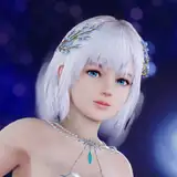
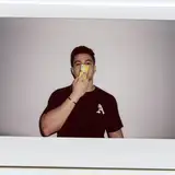
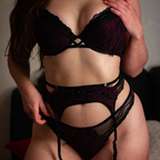
So I'm always striving to make my thumbnails look to where they showcase that I am a reactor, but also not to where I have a "fakeness" to what I genuinely look like watching the material. Please vote and comment HONESTLY as to this will change how my thumbnails will be formated in the future!
Personally, the more I look at the white one, the more of a "eye" catcher it is which will help with new friends encountering my analyses which is always a victory, but part of me feels that I'm watching my child grow up and go through puberty in a way haha
I am open to also doing it to where Patreon exclusive content and shows remain normal and YouTube eligible releases are in the white to help with making it easier for people to find, but I want to hear from yall!


Thank you for your input here with this!!!
Personally I prefer the first one!
So I'm sitting with my graphic designer friend right now and we just updated it to two options haha! Would love for you to look again to see if it's closer to my brand! She was saying the white one "brought out my face more" haha which I can see!
I like 1 & 3 but I feel like 1 is more you. 😁